by tcarlson | Apr 7, 2017 | Divi Tutorials
I love using ET’s Divi theme but sometime there are things that they did that make no sense, like this one. For some reason they decided it would be a good idea to add a right and left margin or padding to all of the ‘Specialty Sections’ and when you enable the ‘Fullwidth’ option in the ‘Advanced Design Settings’ tab it doesn’t actually work. Well, with a bit of CSS you can fix it!
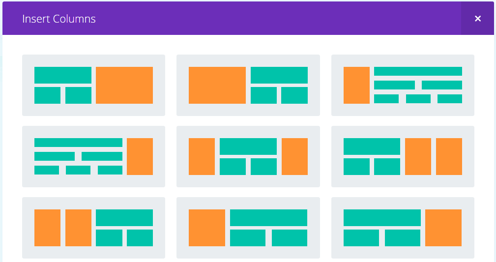
The first thing you need to do is select one of the ‘specialty section‘ layouts of your choice, any one will work.
Now open up the Section Settings, click on the ‘Custom CSS tab’ of your section and add in a Custom CSS Class, I’m using ff-fullwidth-specialty, then save & exit
In the specialty section ‘Advanced Design Settings’ tab there are options to make the section fullwidth. However, this doesn’t work like it does on standard sections and your content will not reach to the edge of the screen as you would expect it to so there is no need to activate it, we are going to do that with CSS instead.
Copy and paste the code below into your Child Theme style.css or if you aren’t using a child theme (which you really should be) then paste into the Divi Theme Options epanel custom CSS section and don’t forget to save.
/*--------------Fullwith Specialty Section----------------------*/
 .ds-fullwidth-specialty> .et_pb_row {
 min-width: 100% !important;
 }
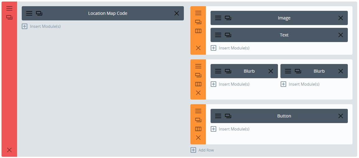
Now you will need to add in the columns, rows and modules you want to use in your specialty section. I’m not going to go through each one as with nine layouts to choose from and 40+ modules there are too many variations to consider, but you get the idea.
You will also need to play around with the padding values in the section, rows and modules to get it looking just how you want.
by tcarlson | Apr 6, 2017 | Ramblings
 The Z-index is a CSS attribute. It establishes the vertical stacking. Essentially, it’s taking a two dimensional layout, your monitor/view port, and adding a 3 dimensional perspective. With the z-index, you are able to stack elements in front of or behind one another giving the impression of depth.
It seems easy enough right? But, you have tried to add or change a z-index to something ridiculous and nothing has happened. Frustrated, empty your cache. Nope, nothing. Well, come to find out, the z-index can only be applied to an element that has a declared position of fixed, relative, or absolute. By default, all elements are set to static.
The z–index property specifies the stack order of an element. An element with greater stack order is always in front of an element with a lower stack order. Note:z–index only works on positioned elements (position:absolute, position:relative, or position:fixed). Default value: auto.
What about those ridiculous numbers you apply, i.e. z-index: 9999999999 ? Well, apparently it’s not all bad. The theory behind this is, it’s easy to set the index in increments of hundreds or thousands because, should you need to come back later, you can always slip something in at 1500 instead of having to adjust everything if you went the 1,2,3,4… route. Remember, the bigger the integer, the closer to you the element will be. You will probably never have a need to go over 999999. I usually use 100s. But you can also use negatives, but be careful. You may end up losing your element behind the background.
There is also something called Stacking Context. The child will always respect parent element. If you have changed your z-index, and still can’t see anything, check to see if it’s being cut off by a parent’s “overflow:hidden”. Each time you create a parent/child relationship, you are creating the opportunity for a new stacking context. You need to be aware of the parent element’s index and position. This will need to have a declared position because if the child is relative, it’s relative to what? Keep in mind, you can nest several elements inside of one another and this is when the parent element becomes very important. Not the easiest to explain, but play around with it and you’ll see what I mean.
by tcarlson | Apr 7, 2017 | Divi Tutorials
Toggles using margin-top: 50px!important;
Accordion using customer Gutter of 4.
Accordion using customer Gutter of 3.
Accordion using customer Gutter of 2.
Accordion using customer Gutter of 1.
Accordion using no custom Gutter
by tcarlson | Apr 7, 2017 | Divi Tutorials
- Add this CSS Code to your Divi, Theme Options, Custom CSS.
#responsive_section {
display: none;
}
- Add the following JS code to the Divi, Theme Options, Integration, <HEAD>. Be sure that you have “Enabled” the header code.
<script>
jQuery(document).ready(function($){
$(“a.responsive”).click(function(){
$(“#responsive_section”).show(1000);
$(‘html, body’).animate({
scrollTop: $(“#responsive_section”).offset().top
}, ‘slow’);
});
});
</script>
Go to the Page that you want the hidden Section to be on and create the following.
- Create a Standard Module Section with a single column
- Add a “Text” module to hold your “button” or “link” that you will use to open the hidden Section.
- Create your link in the “Text module you added earlier, assign it the ‘class’ of “responsive” which tells the JS to open the hidden section.
- Example: <a class=”responsive” href=”#”>Click here to open the hidden section</a>
- Create another Standard Module Section and assign it a “CSS ID” of “responsive_section” which relates to the CSS code below. You can put whatever you want in this Section, this is what’s hidden until you click the link to unhide it.
This is the hidden bit
Lorem ipsum dolor sit amet, consectetur adipisicing elit, sed do eiusmod tempor incididunt ut labore et dolore magna aliqua. Ut enim ad minim veniam, quis nostrud exercitation ullamco laboris nisi ut aliquip ex ea commodo consequat. Duis aute irure dolor in reprehenderit in voluptate velit esse cillum dolore eu fugiat nulla pariatur. Excepteur sint occaecat cupidatat non proident, sunt in culpa qui officia deserunt mollit anim id est laborum.
by tcarlson | Nov 24, 2015 | Ramblings
The Dunning–Kruger effect is a cognitive bias wherein relatively unskilled individuals suffer from illusory superiority, mistakenly assessing their ability to be much higher than is accurate. Dunning and Kruger attributed this bias to a metacognitive inability of the unskilled to recognize their own ineptitude and evaluate their own ability accurately. Their research also suggests corollaries: highly skilled individuals may underestimate their relative competence, they may erroneously assume that tasks which are easy for them are also easy for others, and they may incorrectly suppose that their competence in a particular field extends to other fields in which they are less competent. The bias was first experimentally observed by David Dunning and Justin Kruger of Cornell University in 1999.
Dunning and Kruger have postulated that the effect is the result of internal illusion in the unskilled, and external misperception in the skilled: “The miscalibration of the incompetent stems from an error about the self, whereas the miscalibration of the highly competent stems from an error about others.
refer: https://www.google.com/?gws_rd=ssl#q=The+Dunning%E2%80%93Kruger+effect